Project Challenge
Goals
The project was in its early stages, and the website had the responsibility of telling the team’s working method, introducing the team members, and also giving strength and value to the message and positioning that the group had clearly defined.

Design Approach
Research
The work was collaborative; after an alignment call with the team, I requested active research to better understand their aesthetic ideas and expectations for the project. We then created shared folders on Drive where they placed images and links they found interesting for aesthetics and functionality.
Start
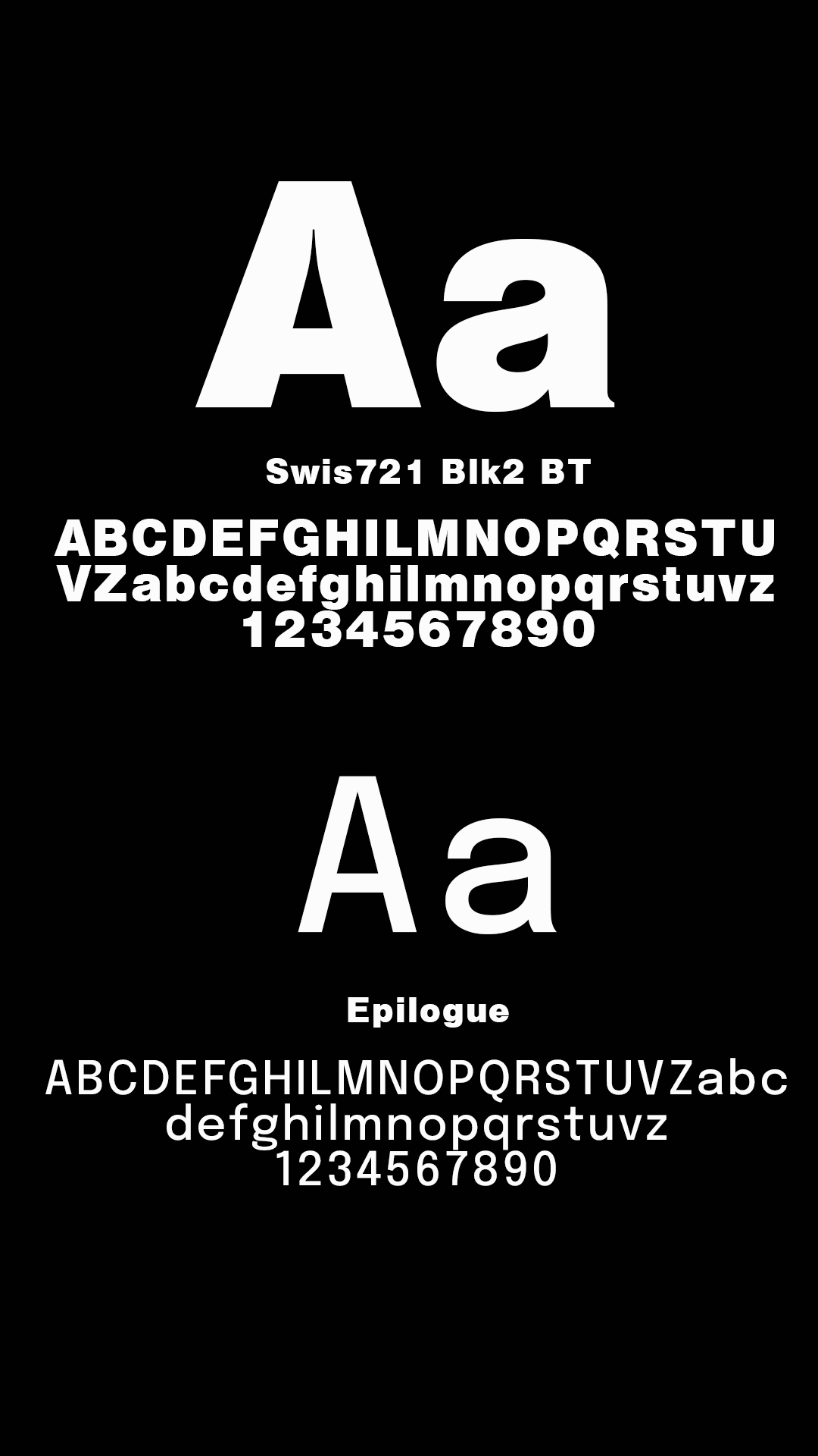
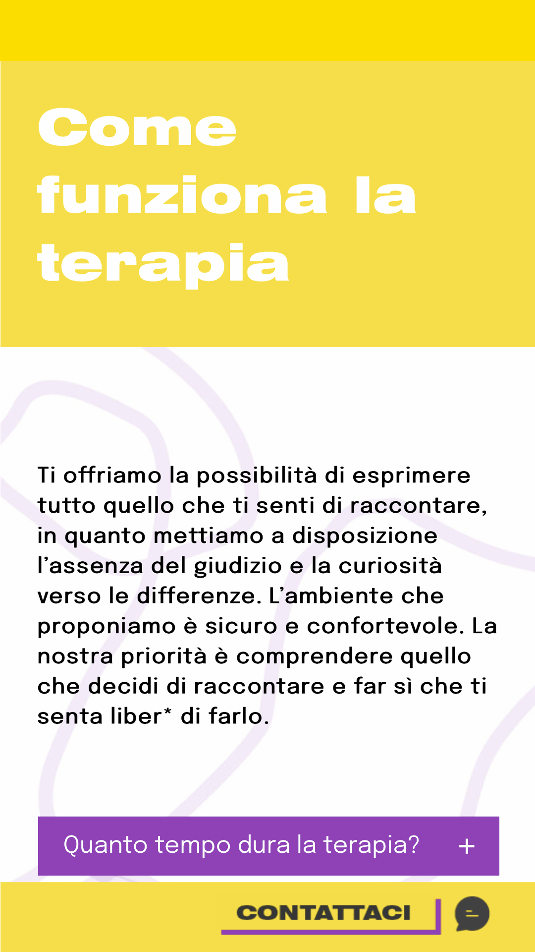
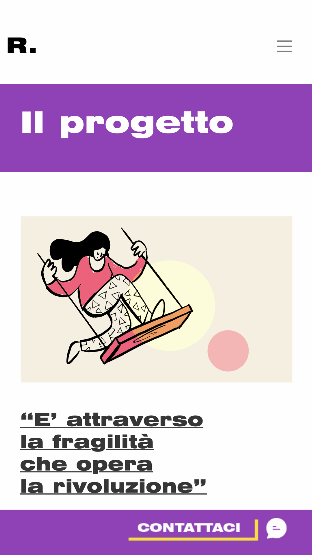
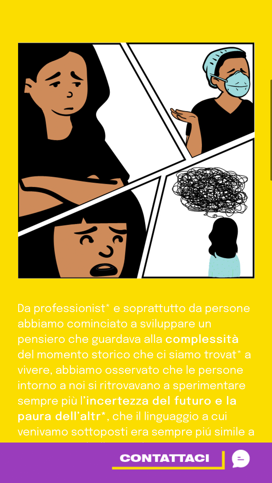
We started by choosing the color palette together, which carries a strong political value, as the yellow and purple are the colors of the non-binary flag, and the fonts. Given the color choice, the typography was selected to be bold and modern so that everything would be fluid and coordinated.


Design Approach
Prototyping
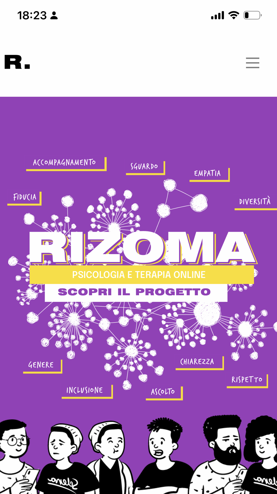
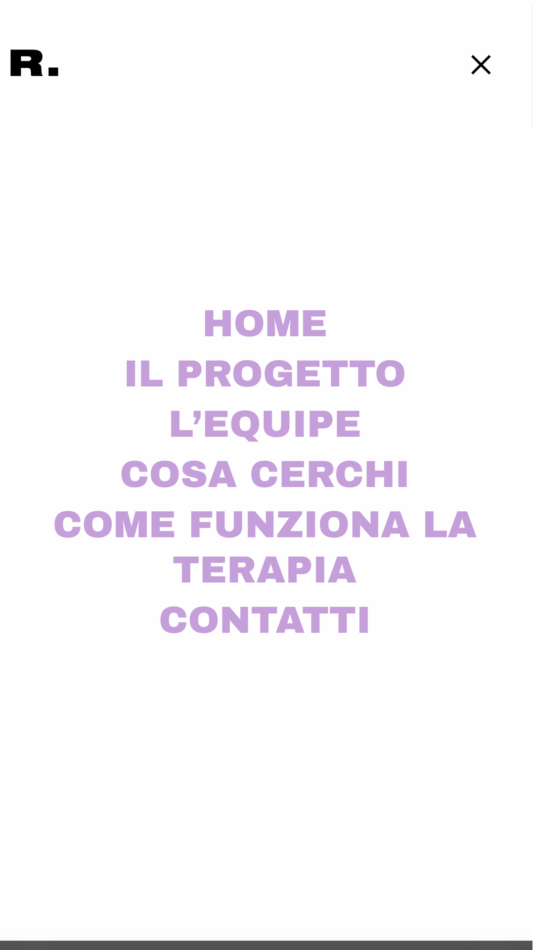
Once the brand identity was chosen, and the website structure and content division were already shared, wireframes were created to capture and organize the content into individual pages. Following this, using Adobe XD, the prototype was developed to verify if the stylistic choices and flow were correct.
Development
Once the prototype version was approved, the website was developed using WordPress. Since it was a streamlined site without any sales mechanisms, I personally took care of the development without the involvement of external developers.
